The independent lifestyle magazine
for progressive creative thinking.
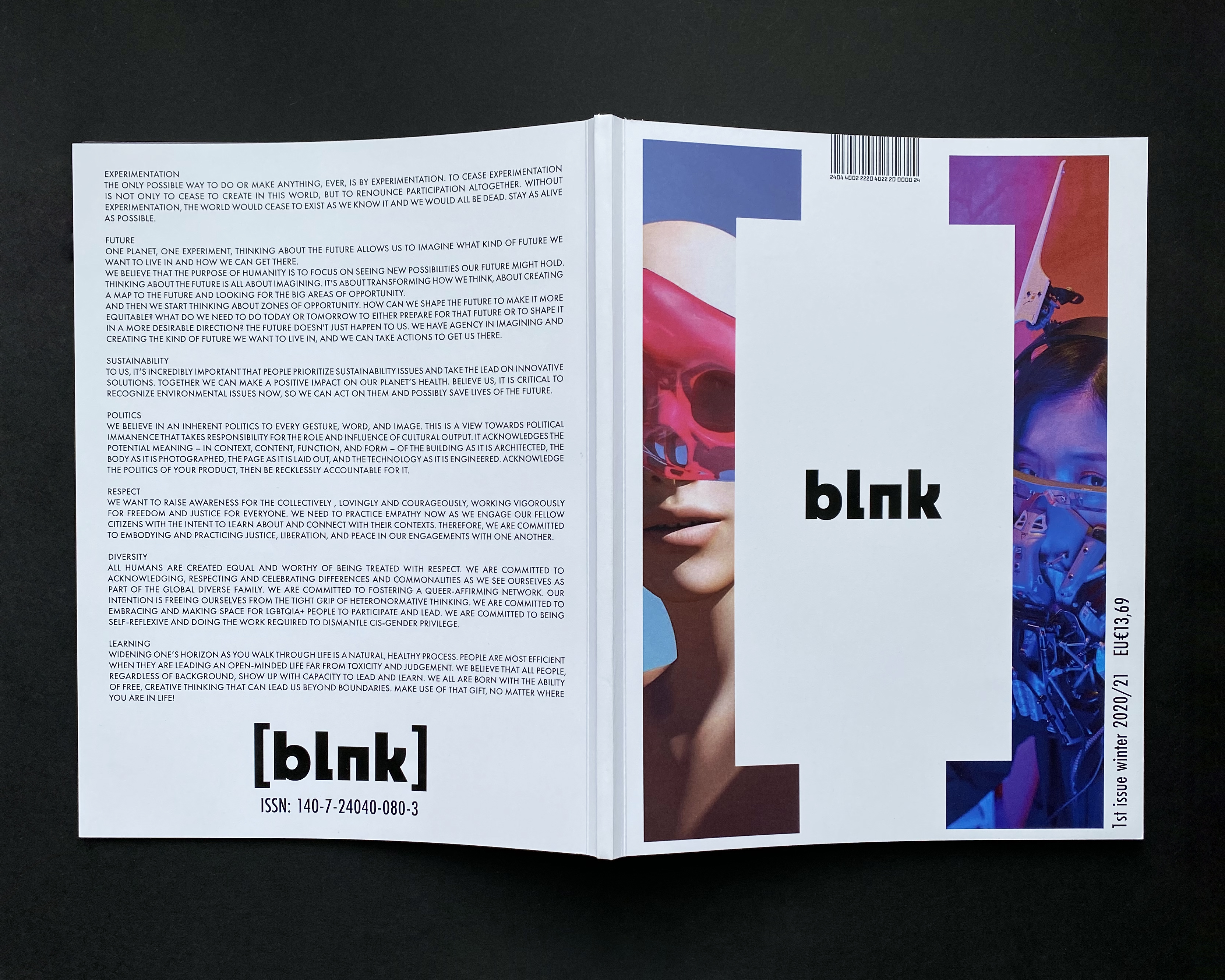
[blnk] is a magazine that bravely tests the limits of the modern lifestyle. The name [blnk] finds its origin in the English word "blank" which is a synonym to "empty". It refers to the future which is not yet fulfilled, but needs to be shaped in a way first.
"To be inspiring and to be inspired" is the main message [blnk] is made to deliver to its readers.
It correlates to the magazine's purpose which is to encourage its mainly young readership to engage in creative and inspiring actions with the future of the world always in mind. With its overall bold style [blnk] motivates people to thinking and especially acting out of the box.
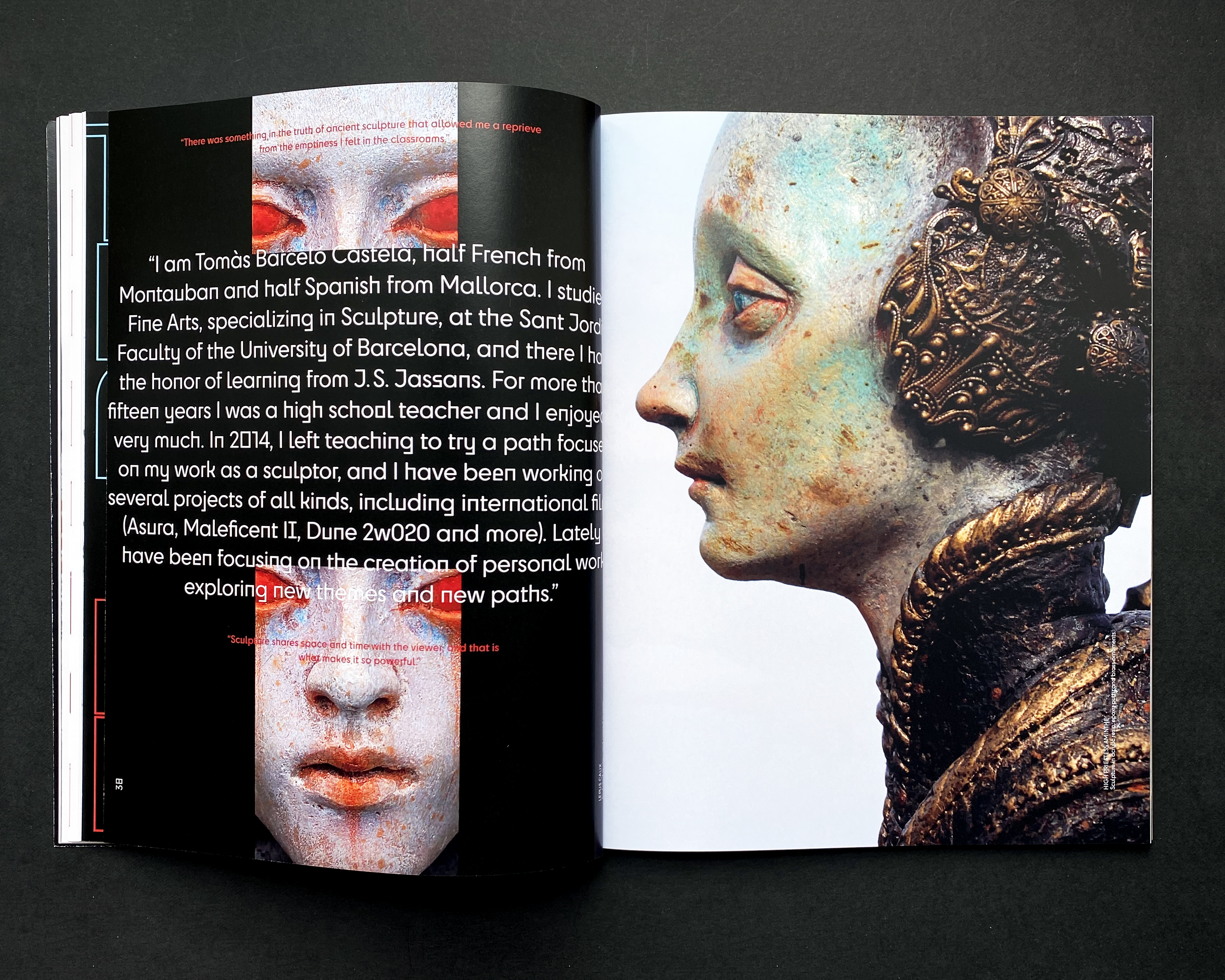
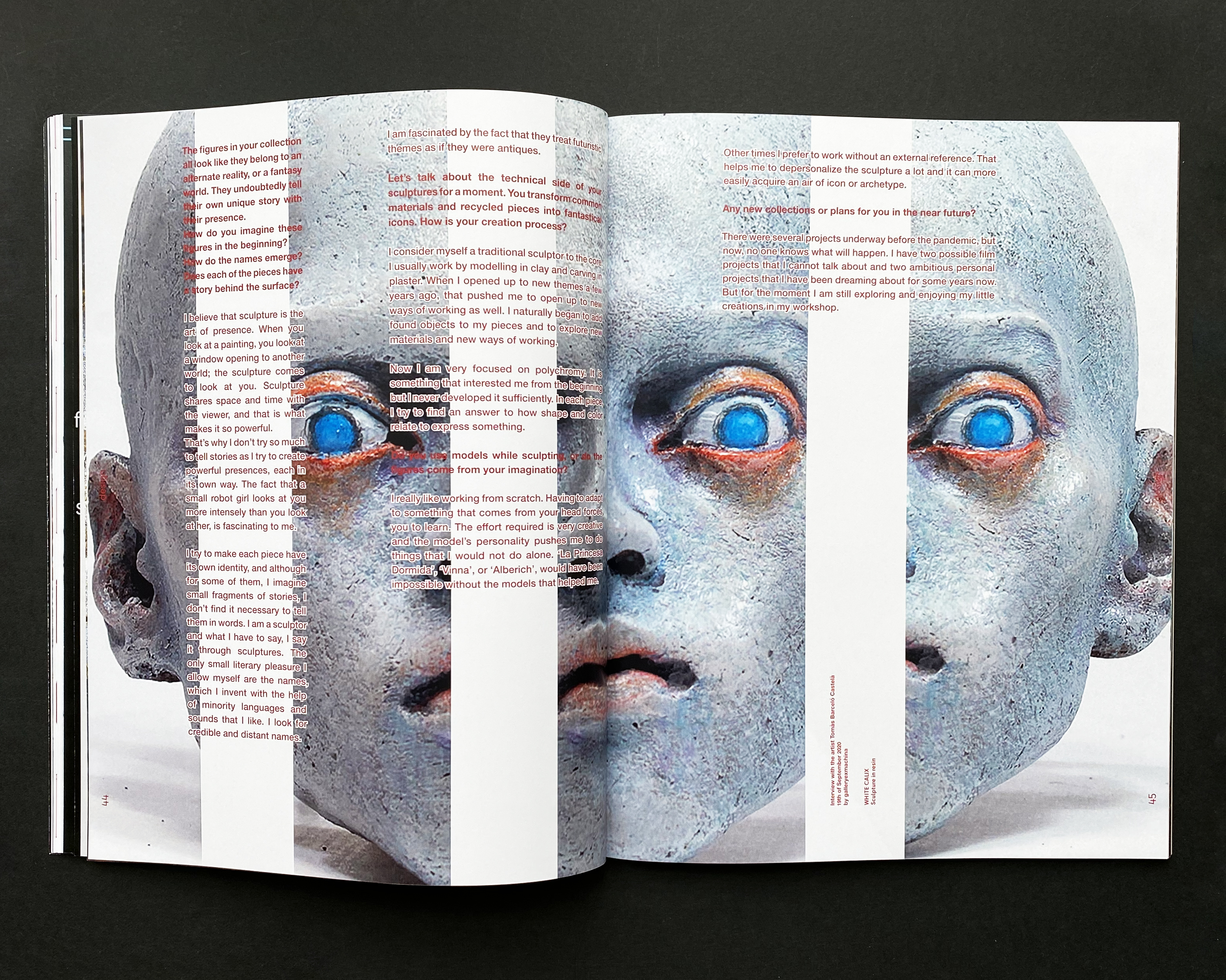
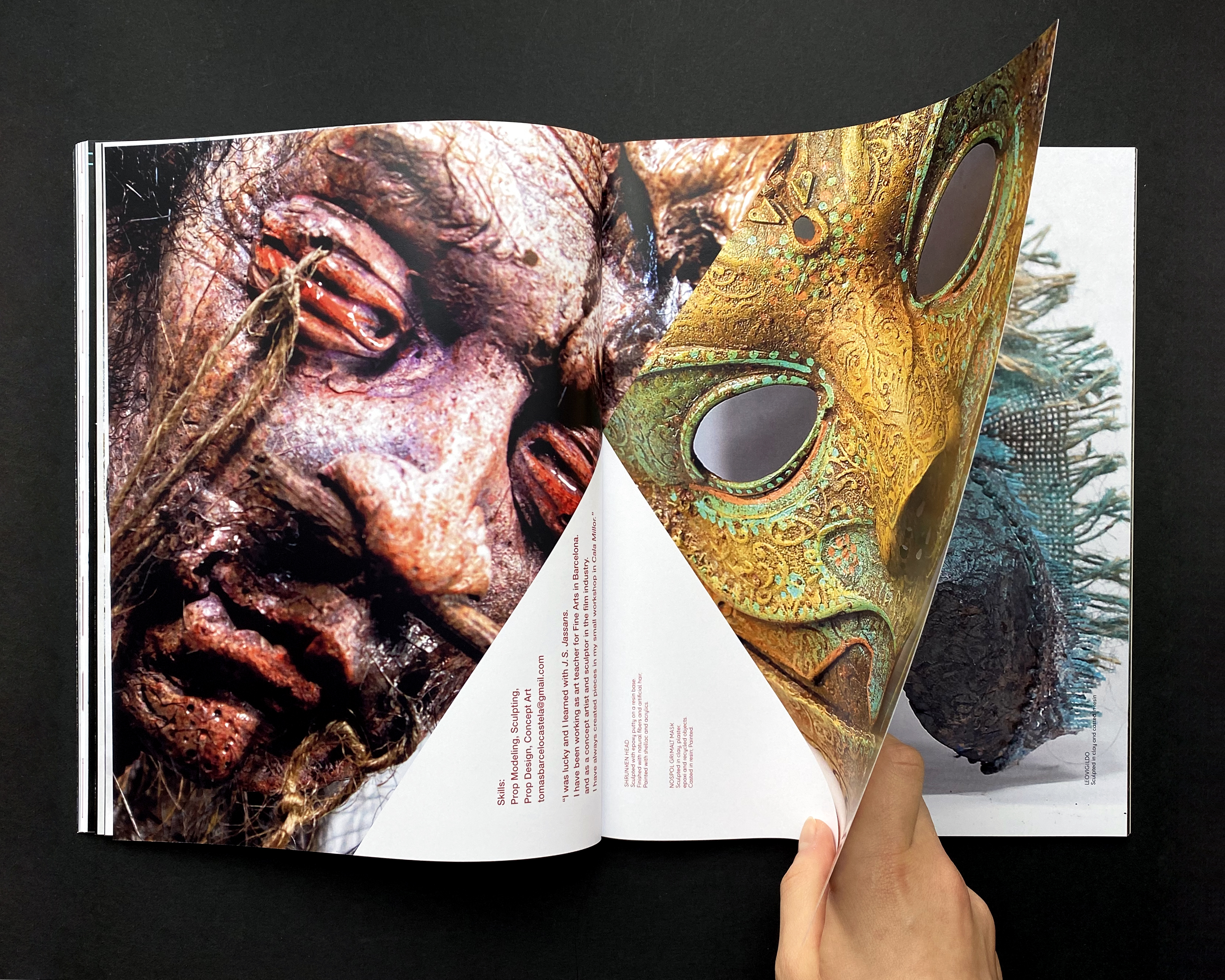
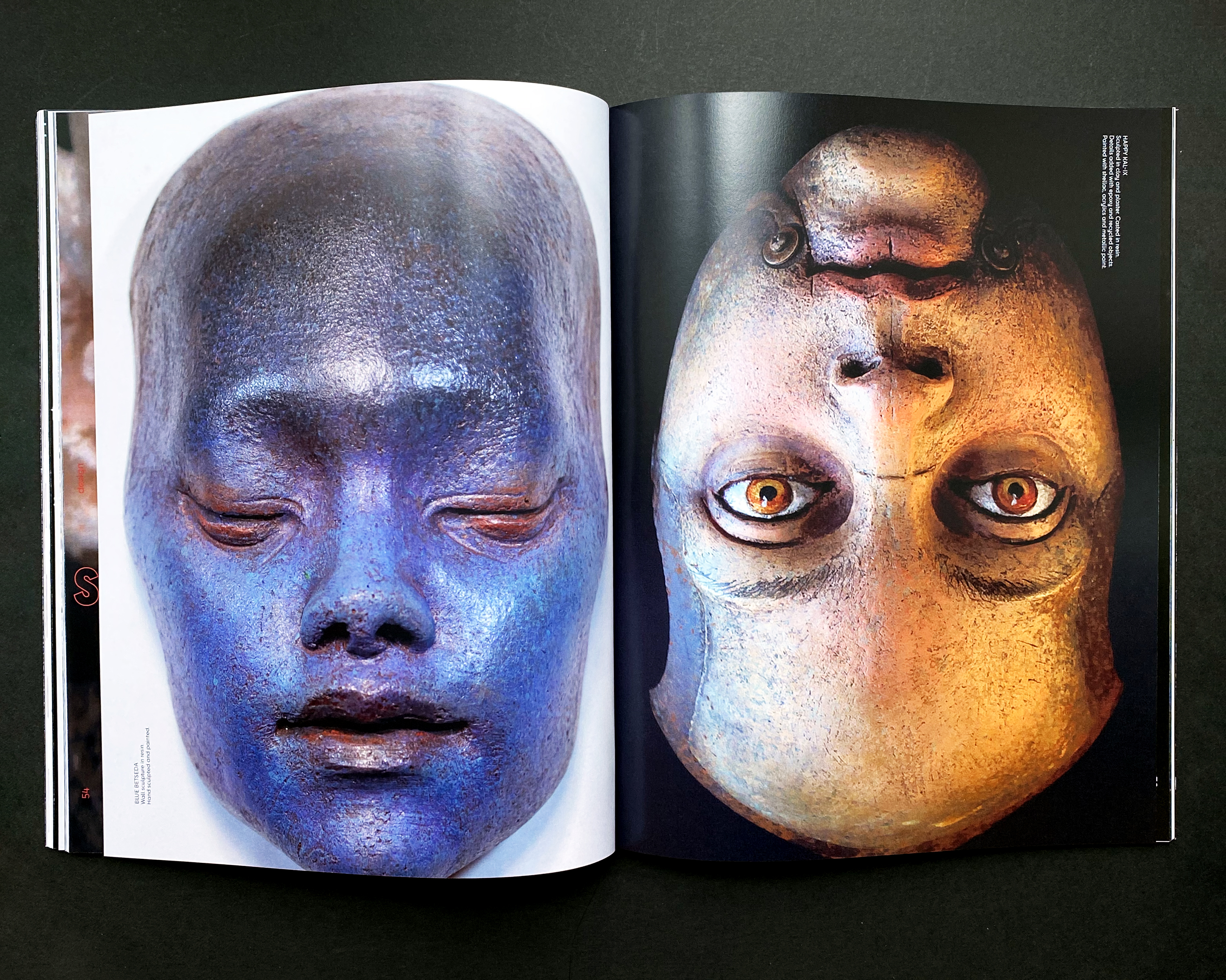
That is why there are several chapters consisting of interviews with fellow creative people, who have found their own unique way of contributing to this society.
Like that [blnk] fills the gap where inspiration for strong and young minds is desperately needed with loud and genuine passion.
The categories are:
[architecture]
[art]
[design]
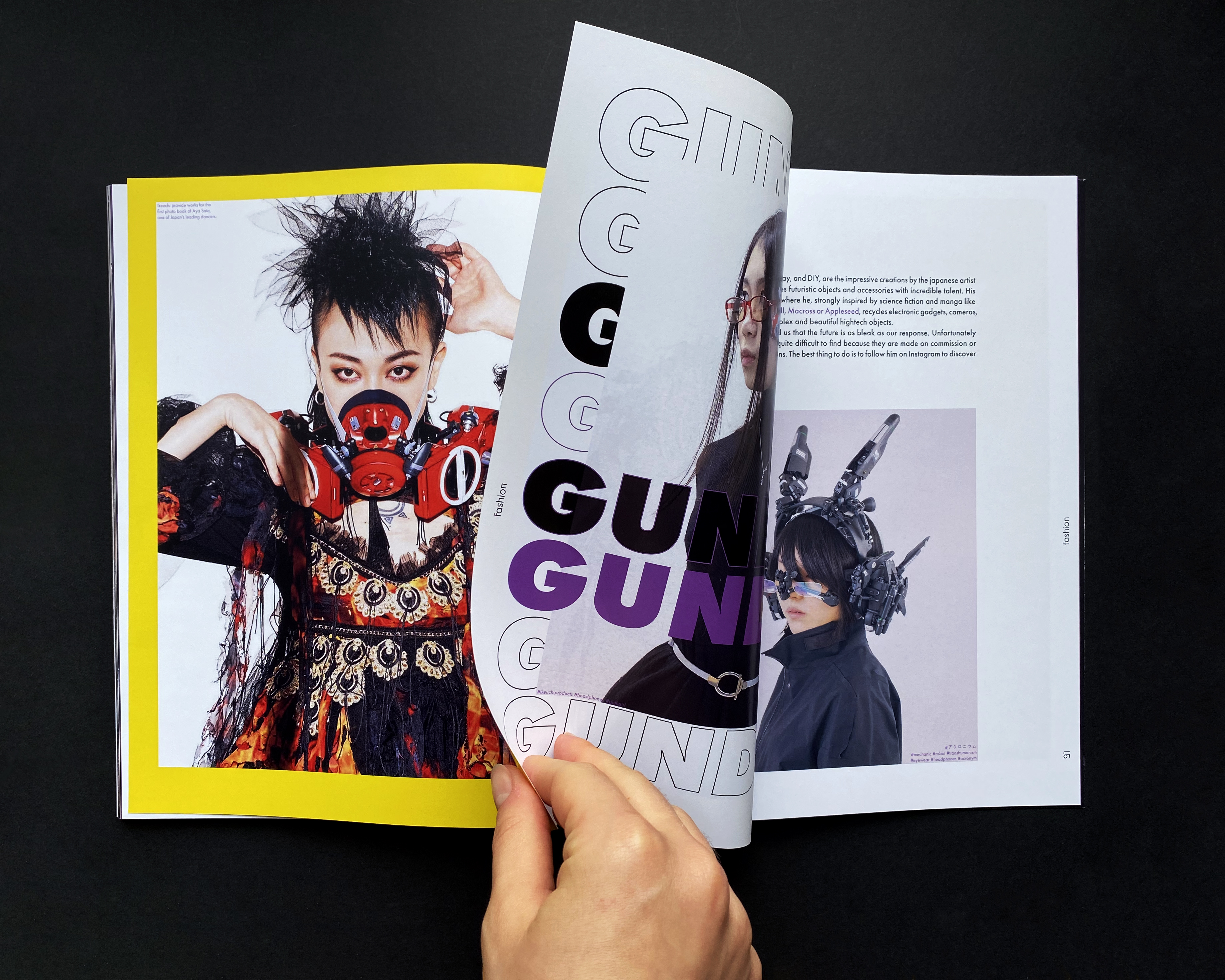
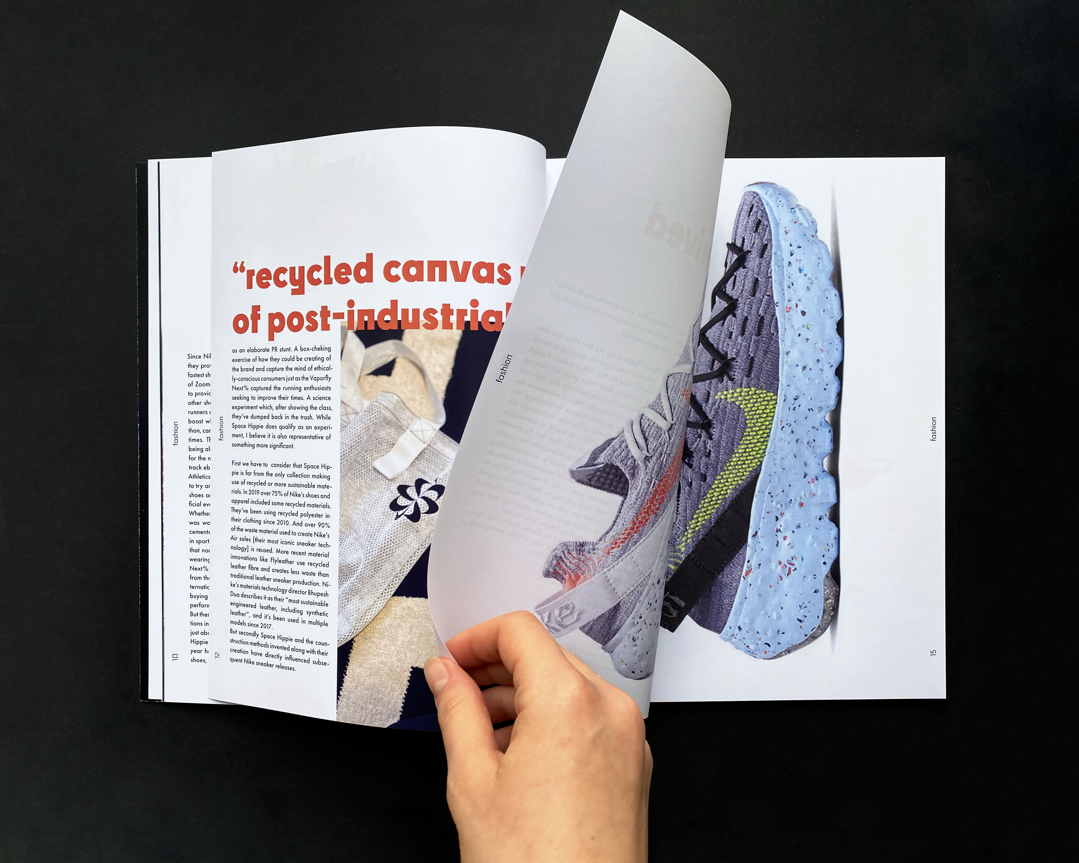
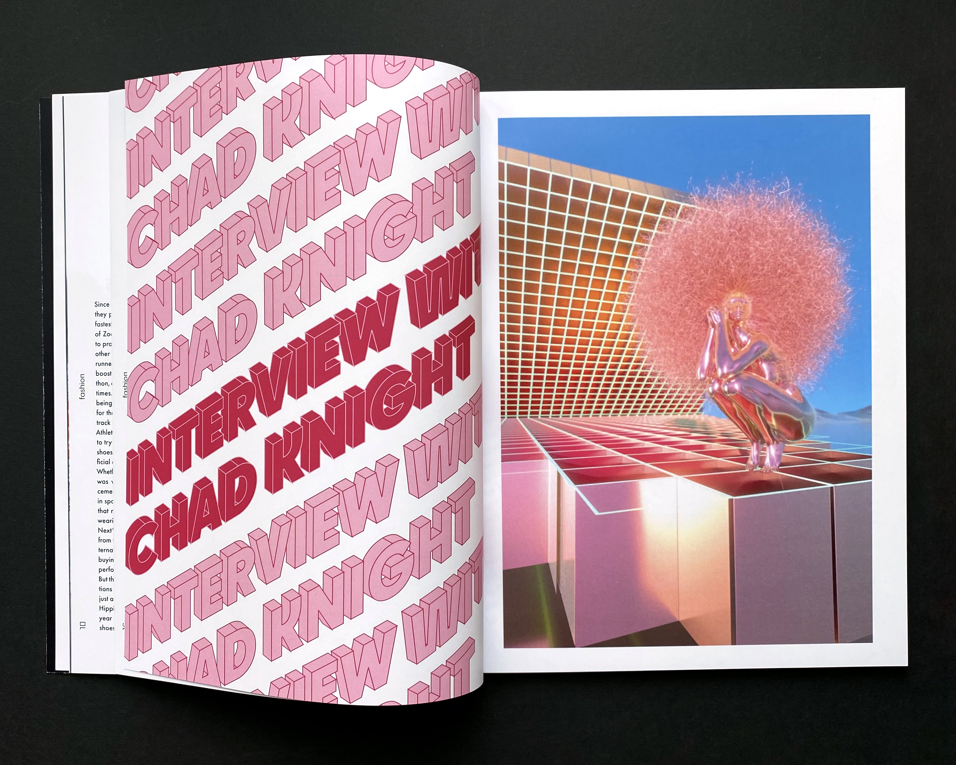
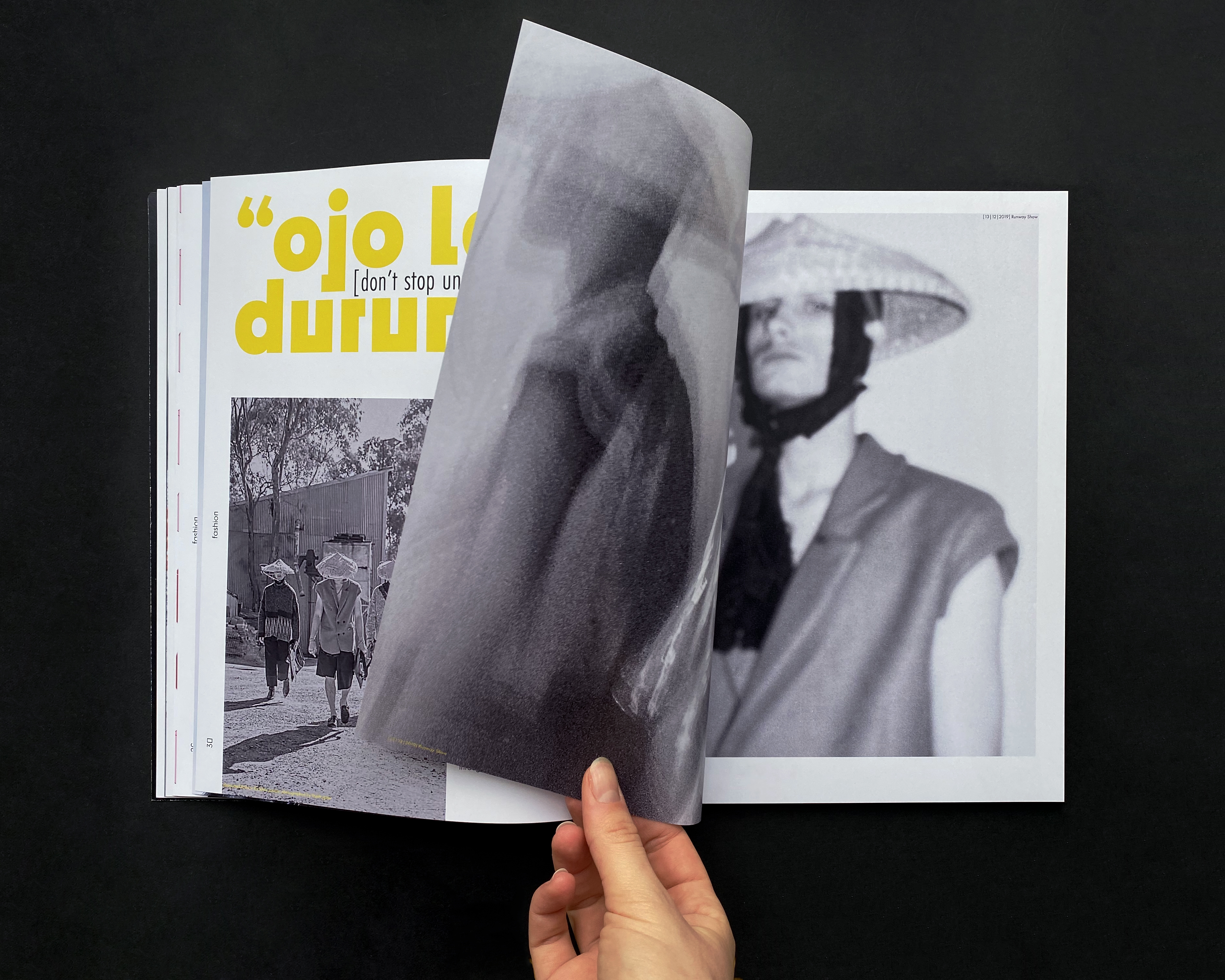
[fashion] and
[society].
Cy is the geometric — in our opinion, futuristic — typeface that plays the leading role in the magazine's typography, as it is assigned to the word mark [blnk] and makes several appearances inside. The brackets that are a part of [blnk]'s logo are used frequently and can be found as a stylistic device on the cover of the magazine.
Issue #zero comes to life through its strong visual language that is built from expressive photos and typhography used to communicate with the reader.
Communication through pictures is especially essential for our modern fast-living world and lifestyle.
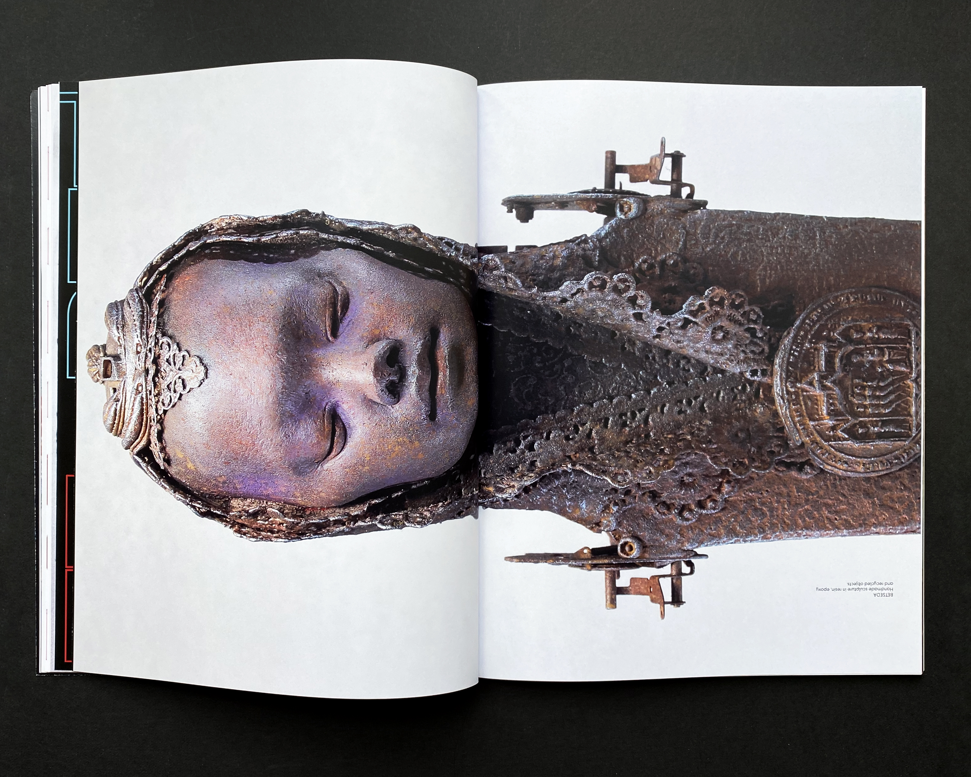
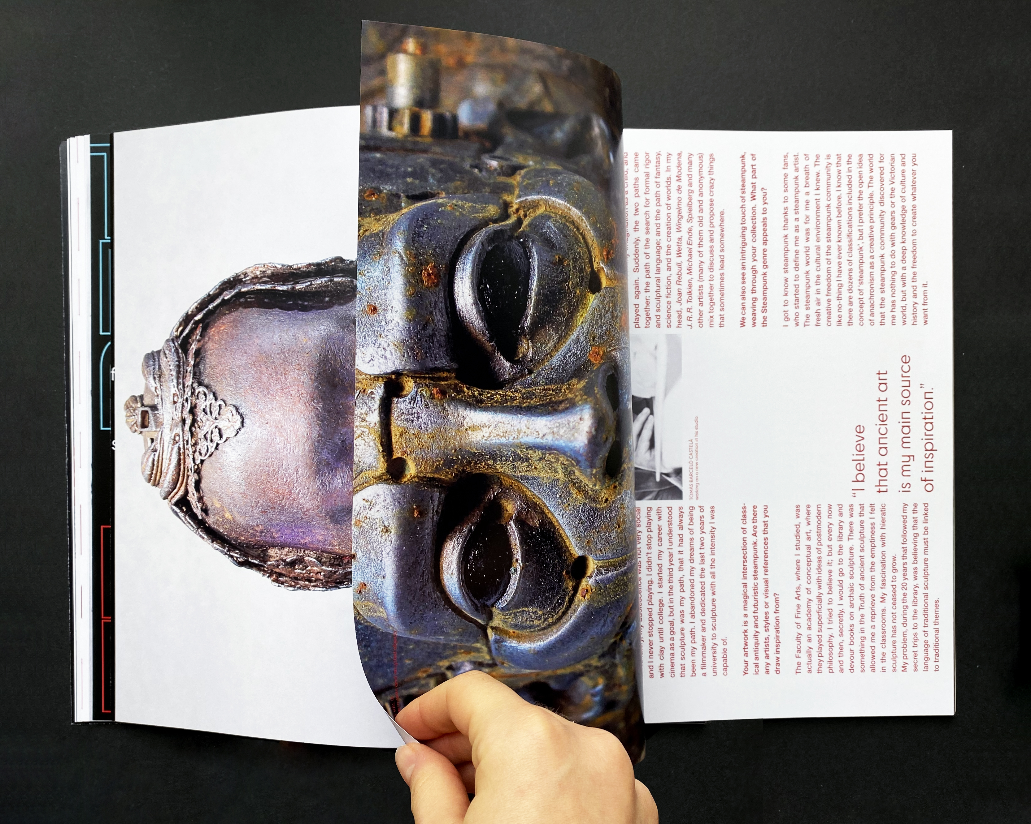
To engage the reader not only visually but challenge them haptically as well, there are pages that have the reader turn the magazine by 90 degrees.
Loud, colorful compositions are frequently used. The magazine employs greyscale pictures and color altogether and a more quiet use of typography can be found as well, making the magazine multi-faceted in style. All in all [blnk]'s elements become an efficient way to capture the eye and mind of the reader.
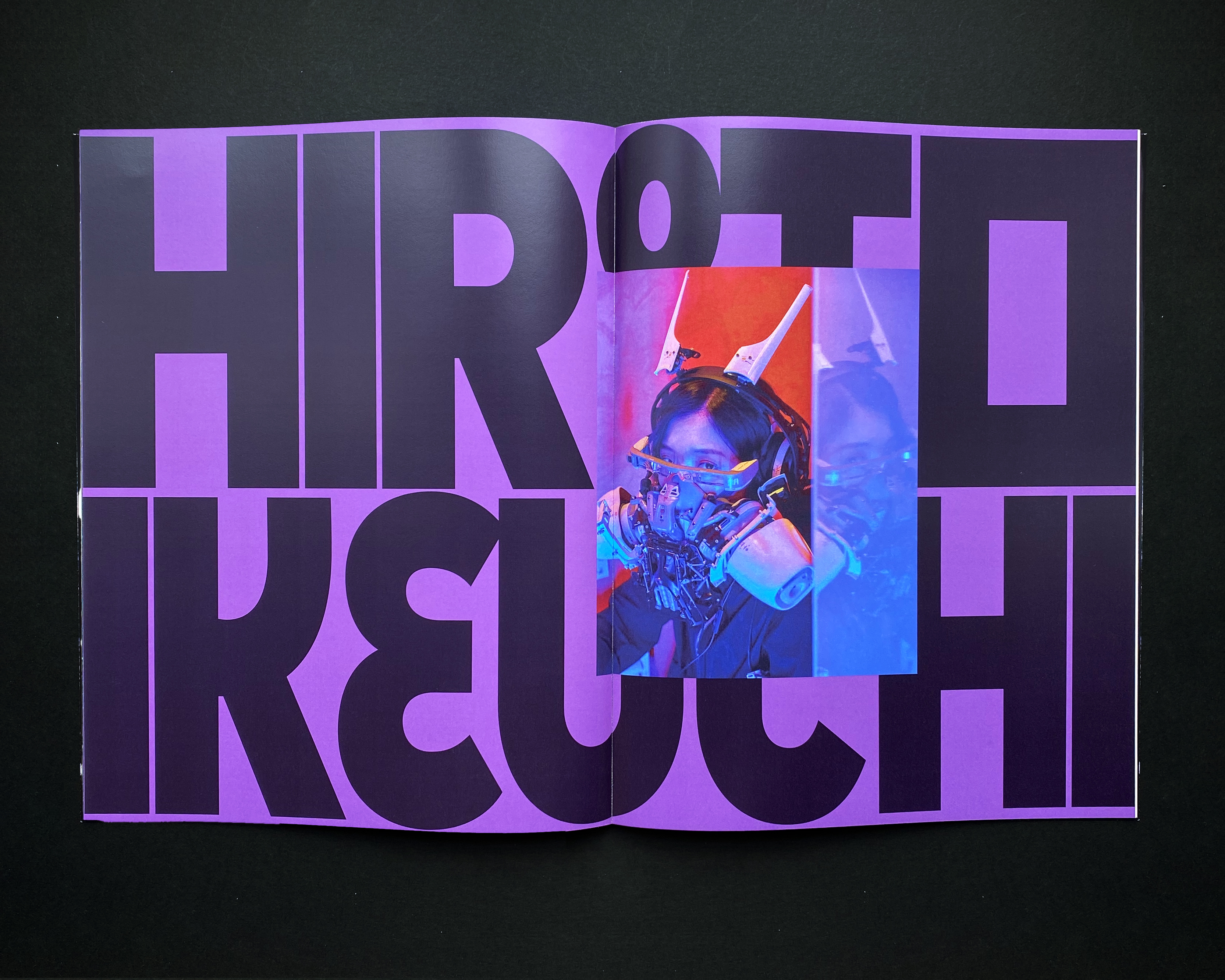
To visualize different subjects in their own unique way, colorful and color-coordinated typography is applied in different sizes, never shying away from crossing an image and crossing borders.
The contemporary topics are always connected to the style of typography used: Three-dimensional letters find their shape in their chapter about three-dimensional art while text blocks that are offset against each other come to use for content about architecture.
While [blnk] combines quiet and loud layouts always depending on the content of the chapter, each difference contributes to the magazine's look as a whole that finds its harmony through contrast.
This magazine was created as a fictional university project,
together with Celina Hofmann and Michaela Kappes.